THIRD EYE.TV
Building workflows for cricket administration.
- Project scope
- End-to-end design of multiple touchpoints
- Role
- UX design, Graphics & owned select features
- Tools
- Figma, Gimp
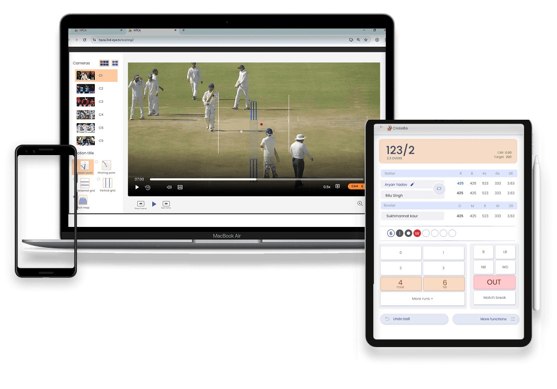
The outcome
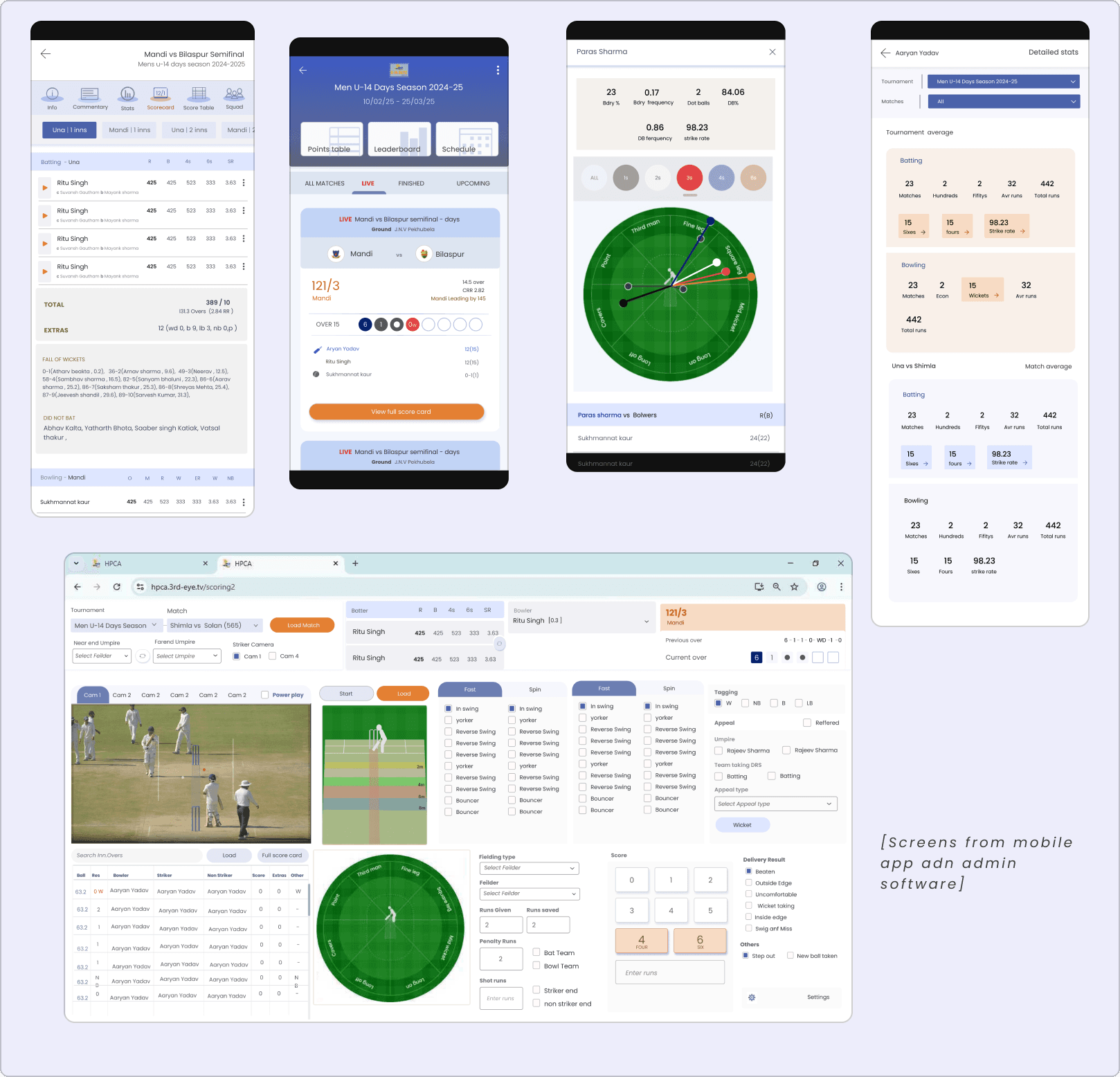
Contributed to the building of a suite of digital cricket products spanning scoring, administration, and audience-facing experiences, built around user-tested workflows and established practices.
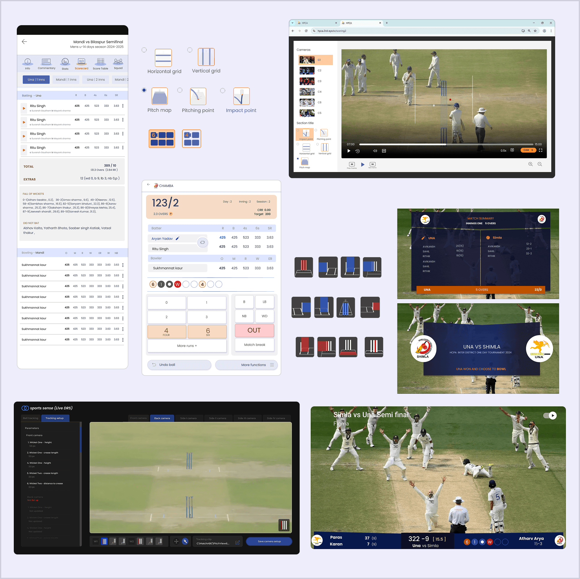
The story
Third eyeTV is a company with multiple cricket administration products including live scoring, public-facing applications, tools for match officials, and internal management systems.
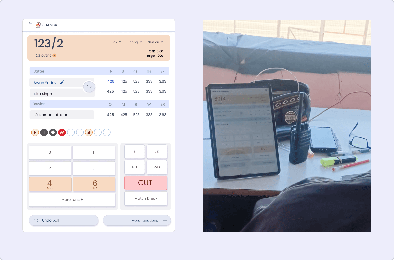
I joined the project during its scoring app redesign, helping build a scoring tool for umpires. Working closely with them, I translated their on-field practices and muscle-memory workflows into an intuitive, fast-paced interface that minimised friction during live match scoring.
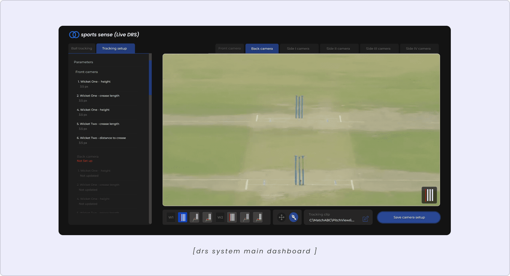
I also contributed to a new DRS product, shaping its core interface and dashboard layout. Despite evolving requirements, the foundational layout I designed continues to underpin the product today.
Beyond this, I contributed to UX navigation and flows for the consumer-facing app, scorecard UI design, and additional screens as the product evolved. I also created supporting visual assets, including custom iconography and dashboard graphics.
Select decisions.
Designing the DRS workflow
The challenge
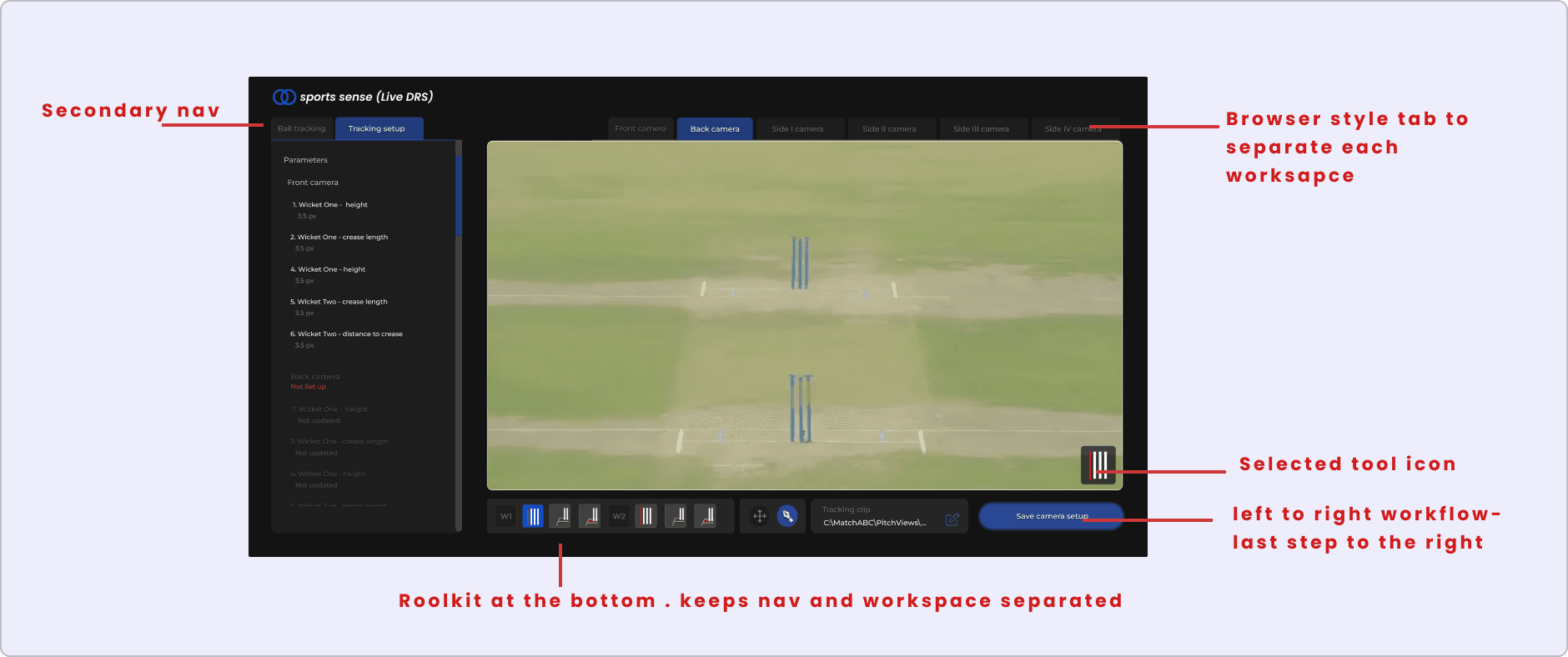
The DRS system needed to support six cameras, each with its own settings, tools, and sub-settings. Officials needed to switch between camera-specific workspaces while keeping the main video feed accessible and the overall interface consistent.
The design & rationale
Drawing from familiar web applications and tools like Figma, I structured the interface into three layers: top tabs to switch between distinct camera workspaces, a left sidebar for contextual settings and navigation, and a bottom toolbar for frequently used tools. This separated different types of interaction while keeping controls accessible and the video feed unobstructed. Custom icons further helped distinguish tools at a glance.
Designing a score ticker for a mobile-first broadcast
The challenge
Mobile-first broadcasts offered limited screen space, but the score ticker still needed to display essential match information without obscuring the live action.
The design & rationale
I used a curved, compact layout to extend the ticker horizontally towards the edges of the video, making better use of peripheral screen space while keeping the central viewing area clear. The opposing teams were visually separated, with scores and match details kept easy to scan.
Designing for fast, accurate scoring
The challenge
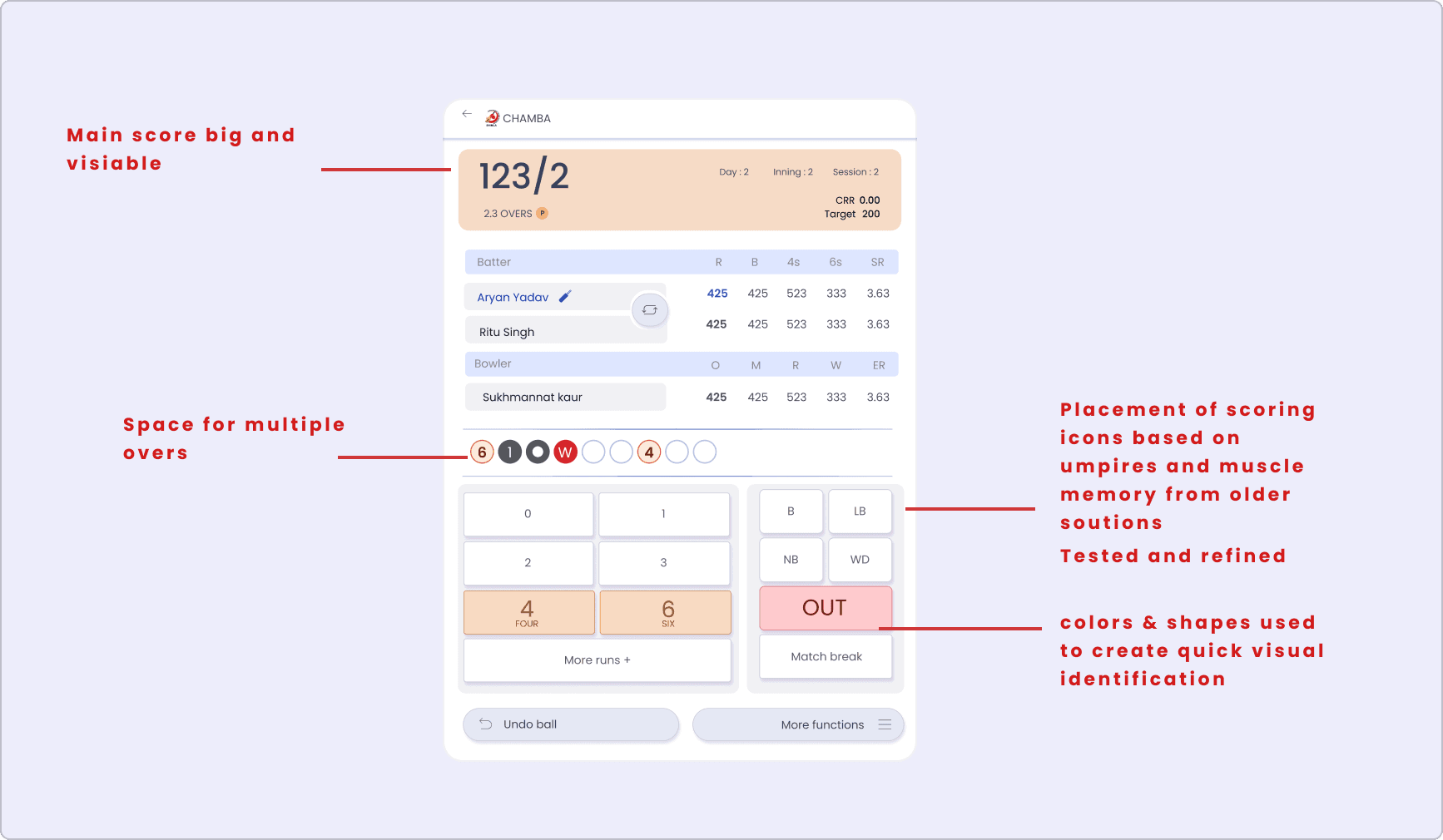
Design a scoring interface that umpires could operate quickly and accurately during a live match, with minimal disruption to their focus on the game.
The design & rationale
Working closely with umpires, I refined the placement, grouping, and visual hierarchy of scoring controls to align with their existing practices and muscle memory. Colour and contrast helped distinguish common actions, while consistent layouts made controls easier to locate and use under pressure.
Looking back
The colour palette was already established, but looking back I'd push the contrast a bit more, especially on certain buttons like the switch batter icon, to make the priority stand out more.
Back then we were led by keeping it colourful yet professional.