WEDLUK
Turning a traditional matchmaking model into a digital experience.
- Project scope
- Branding, Marketing website
- Role
- Primary product designer: Branding , UX, UI, Copywriting, Graphics
- Tools
- Figma, Gimp
The outcome
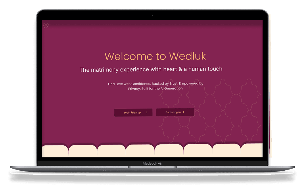
Translated a traditional, agent-led matchmaking model into a market-ready digital platform, bridging established offline practices with a structured, user-friendly experience.
The story
WedLuk was conceived as a matrimony platform that would bring together the convenience of modern matchmaking apps and the personalised, broker-led experience of traditional matrimony services.
The initial concept was solid but here was a gap in hwo we would translate it into a workable digital product that captured the benefits of offline model while keeping it relevant in the digital matrimony market.
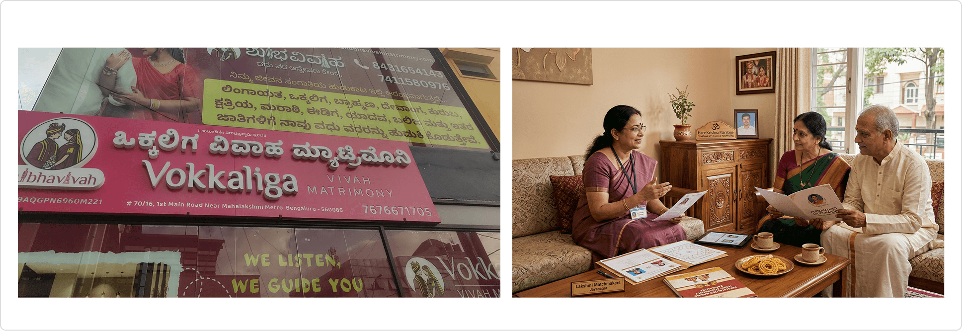
I worked closely with the business owners to understand how the existing service operated, supplemented by research into competing platforms to identify user expectations and common pain points
A key challenge was translating the multi-layered offline matchmaking process into a cohesive digital experience. Younger clients expected a modern, dating-app-like experience, while parents often managed multiple children's profiles and played an active role in evaluating matches. Agents and business owners had their own workflows and responsibilities to accommodate.
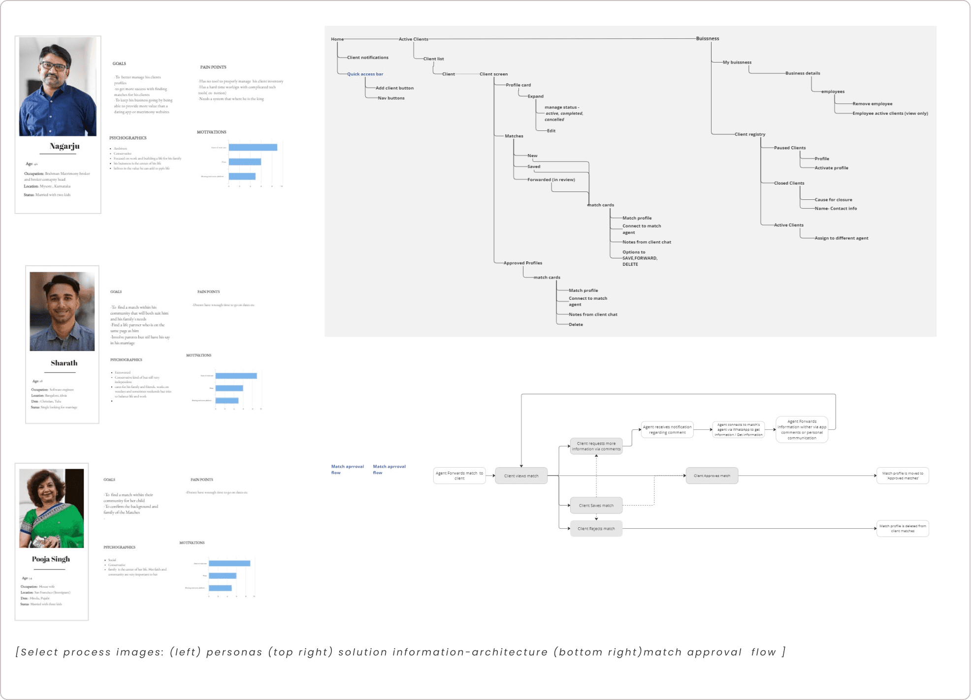
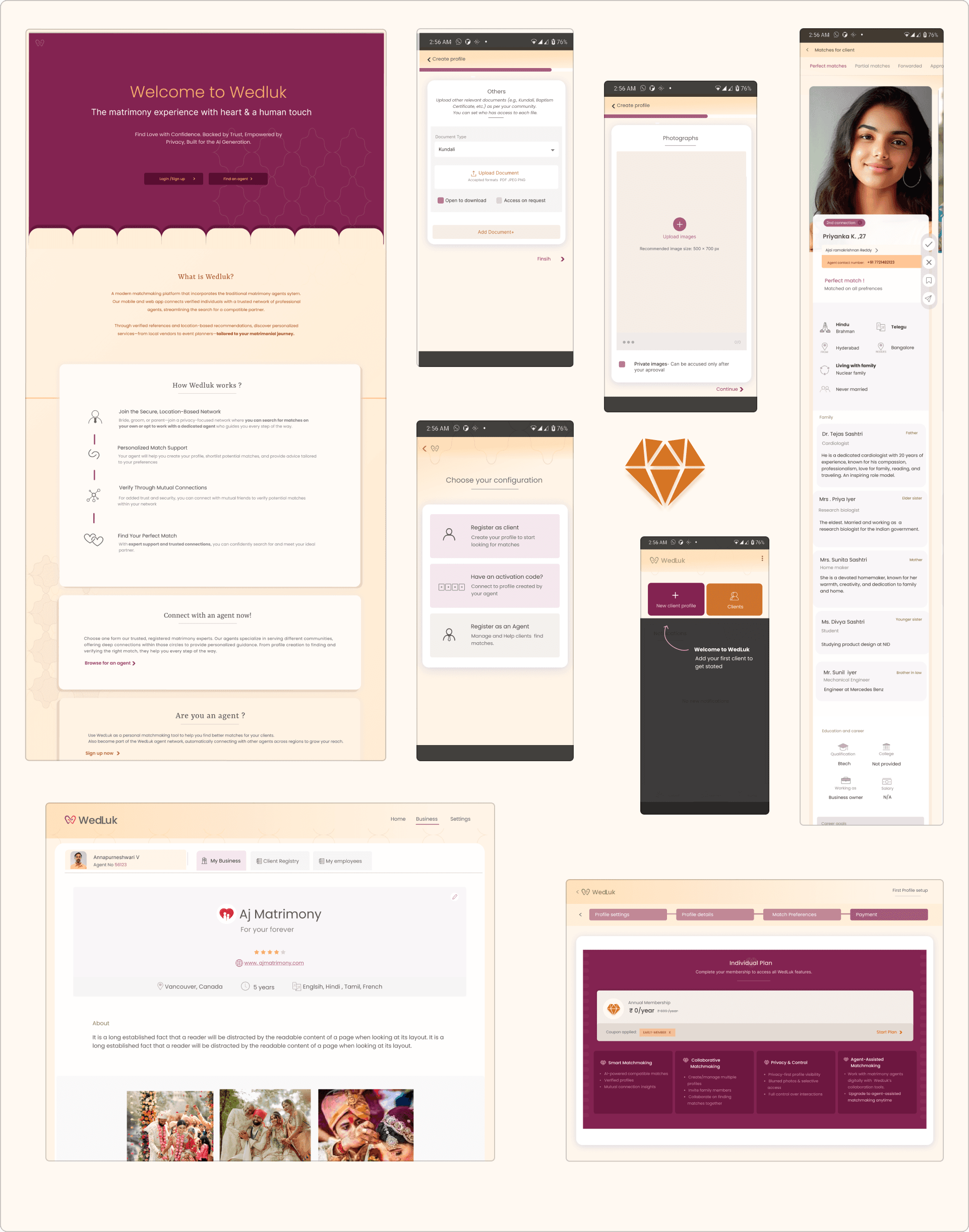
The solution was a set of distinct but connected experiences: a client-facing app (profile discovery, preferences, and match evaluation), an agent workspace (managing clients, shortlisting and sharing profiles), and a business owner dashboard (overseeing agents, clients, and platform activity). Each served a specific role while keeping the matchmaking process connected end to end.
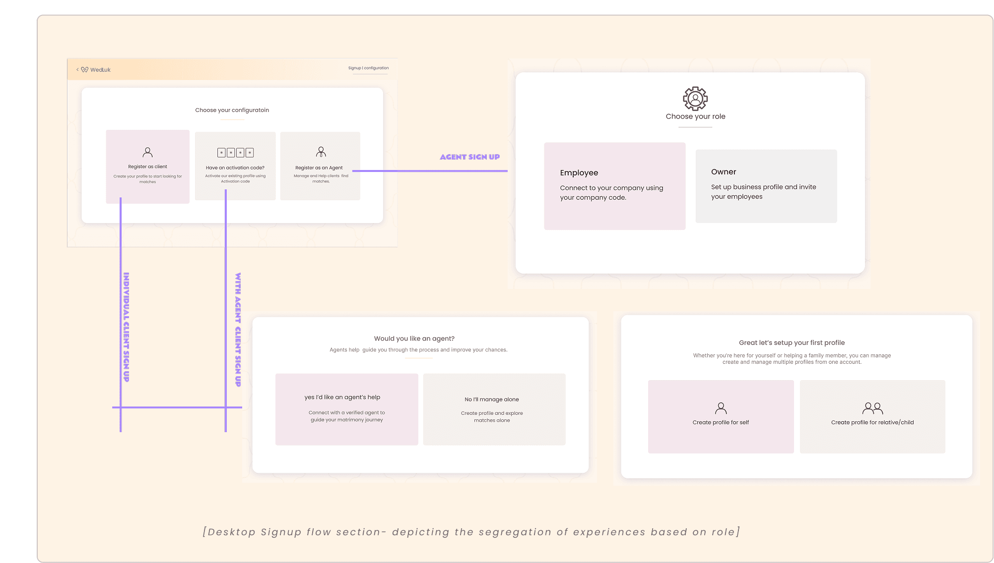
SELECT DECSIONS
1 .MAKING MATCH DISCOVERY FEEL SEAMLESS
THE CHALLENGE
Existing matrimony apps relied on list-based interfaces that required users to repeatedly open and exit individual profiles, interrupting the browsing experience.
THE DESIGN & RATIONALE
Inspired by the intuitive browsing patterns of dating apps, I introduced horizontally browsable profiles with vertically scrollable details and floating actions. Unlike the one-profile-at-a-time model, this kept the entire collection accessible while allowing users to review profiles in depth and approve, reject, or save them without interrupting their browsing
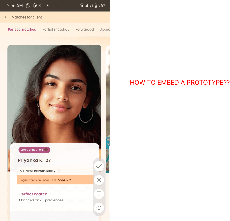
2 . DESIGNING FOR HOW AGENTS WORK
THE DESCISION
Organise the experience around one client at a time, with a dedicated workspace for managing their matchmaking journey.
THE RATIONALE
Traditional agents typically work closely with one client before moving to the next. Rather than imposing a conventional dashboard-first workflow, I designed around this existing behaviour, bringing client information, matches, and actions into one place. This interaction model also informed the client-facing experience, while allowing matches to be shared across clients where needed.
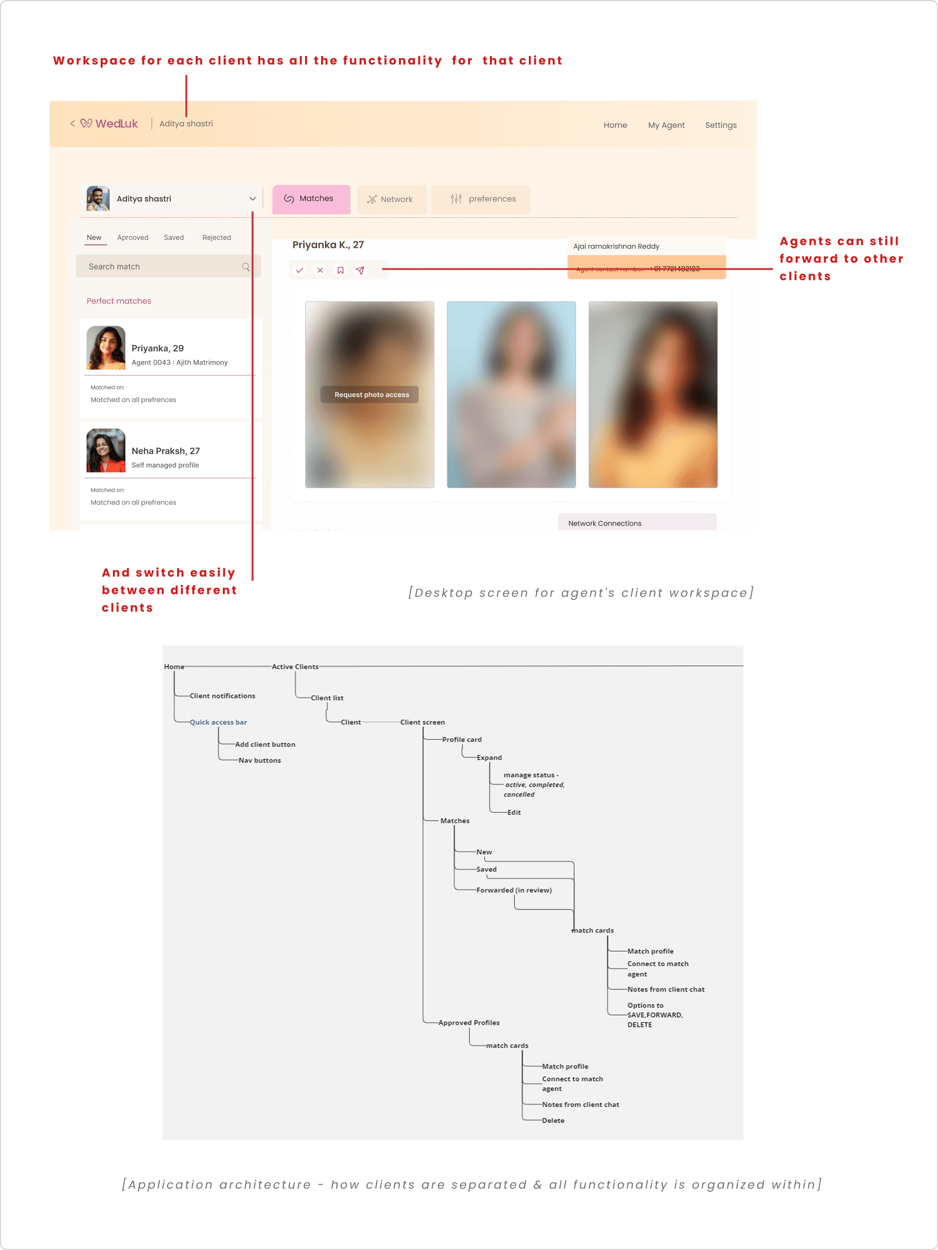
3 . BUILDING A SCALABLE PREFERENCE DATABASE
THE CHALLENGE
The challenge: Matchmaking preferences vary widely between individuals. How could the system accommodate unique requirements while keeping the underlying data structured and manageable?
THE DESIGN
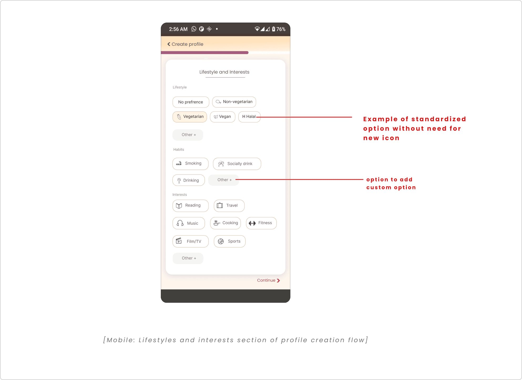
Combine standardised preference options with the ability to add custom ones. Create a unified icon system where custom preferences use their initial letters as icons.
THE RATIONALE
Standardised options provide consistency for filtering and matching, while custom entries accommodate individual needs. These entries also create a way to gradually expand the preference database: frequently repeated custom options can be reviewed through internal audits and promoted to standardised choices.
Letter-based icons keep user-added preferences visually consistent without requiring a new icon for every addition.